A New Brand for Portland

Portland Design Co developed a municipal brand intended to unify messaging across all city departments, as well as to improve awareness of both the variety of services the City offers and the physical locations that the City manages. This is known as municipal or council branding, rather than place branding which is meant to attract business, tourism, and growth.
In September 2019, the City of Portland invited design agencies with experience in brand development and marketing strategy to propose for a chance to develop the City’s new visual identity. The initial goal was to develop a common brand for all city departments to communicate with the public, to support talent, business, and arts attraction, and to be recognized as a smart city and innovation hub.
In November 2019, Blaze Partners and Portland Design Co were dually-awarded the project, which was soon thereafter put on hold due to COVID-19. When the project resumed in February 2021, priorities had shifted—Portland sought new and improved ways of communicating with its constituents, which was especially important in a time of COVID. Rather than emphasizing Portland as a smart city and innovation hub, it was crucial that they first connect with the people who live, work, and visit their city through clear and efficient communications. The City needed a unique and approachable brand mark identifier that people could connect with.

Photo by Corey Templeton.
The discovery phase began with PDC and Blaze conducting two surveys to gain feedback from the public regarding how well they were aware of the services the City provides, how they interact and communicate with the City, how they feel about current service levels, and their current level of satisfaction with the City. We received responses from almost 200 residents, business owners, and workers; showing that improved communication could help build the trust constituents feel is currently missing from the city/resident relationship. The second survey revealed three overarching themes—residents are interested in more information from the City, there is a low level of awareness of the types of services the City offers, and that the City’s website is a critical source for information. The need for clear and efficient communications helped guide the logo design process.
For years, the City had relied on the official seal as their identifying visual “icon” throughout all marketing and communications. It was clear the new logo couldn’t be too flashy, and needed to be welcoming to a broad range of residents, workers, new Mainers, transplants, and business owners. Portland has a wide range of people with whom it needs to communicate and the people were seeking information, not a destination brand.
The mark needed to be simple enough that it could be as recognizable at 16 pixels on a website, and clean enough to be embroidered or screen printed on a staffer’s fleece. We began gathering inspiration and sketching “P” logo mark centered around communication, community, and the abundance of creativity within Portland.
Visual discovery phase and inspiration. Photos of Portland by Sophia Aldinio & Corey Templeton.
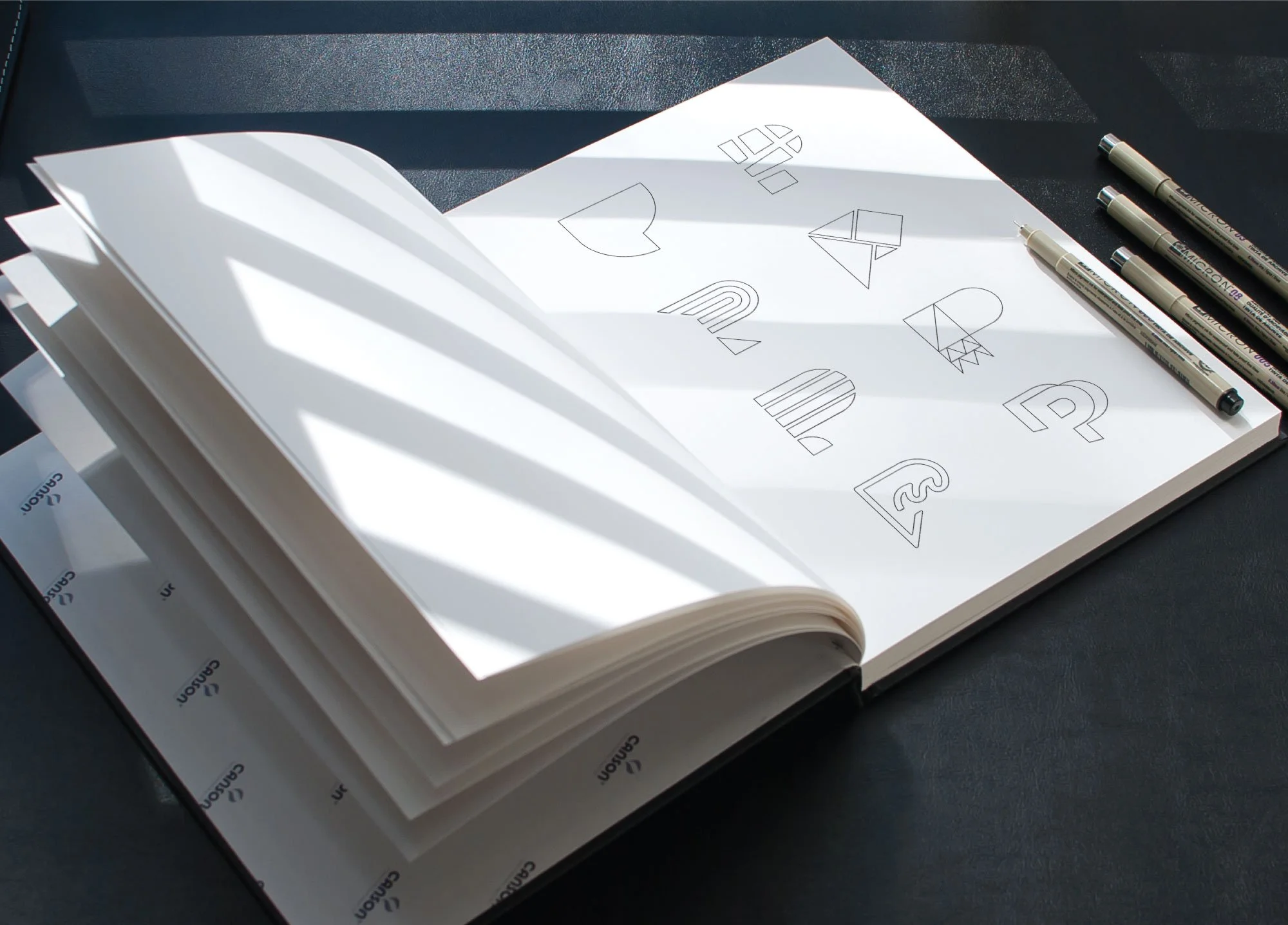
Sketching a new brand mark for Portland.
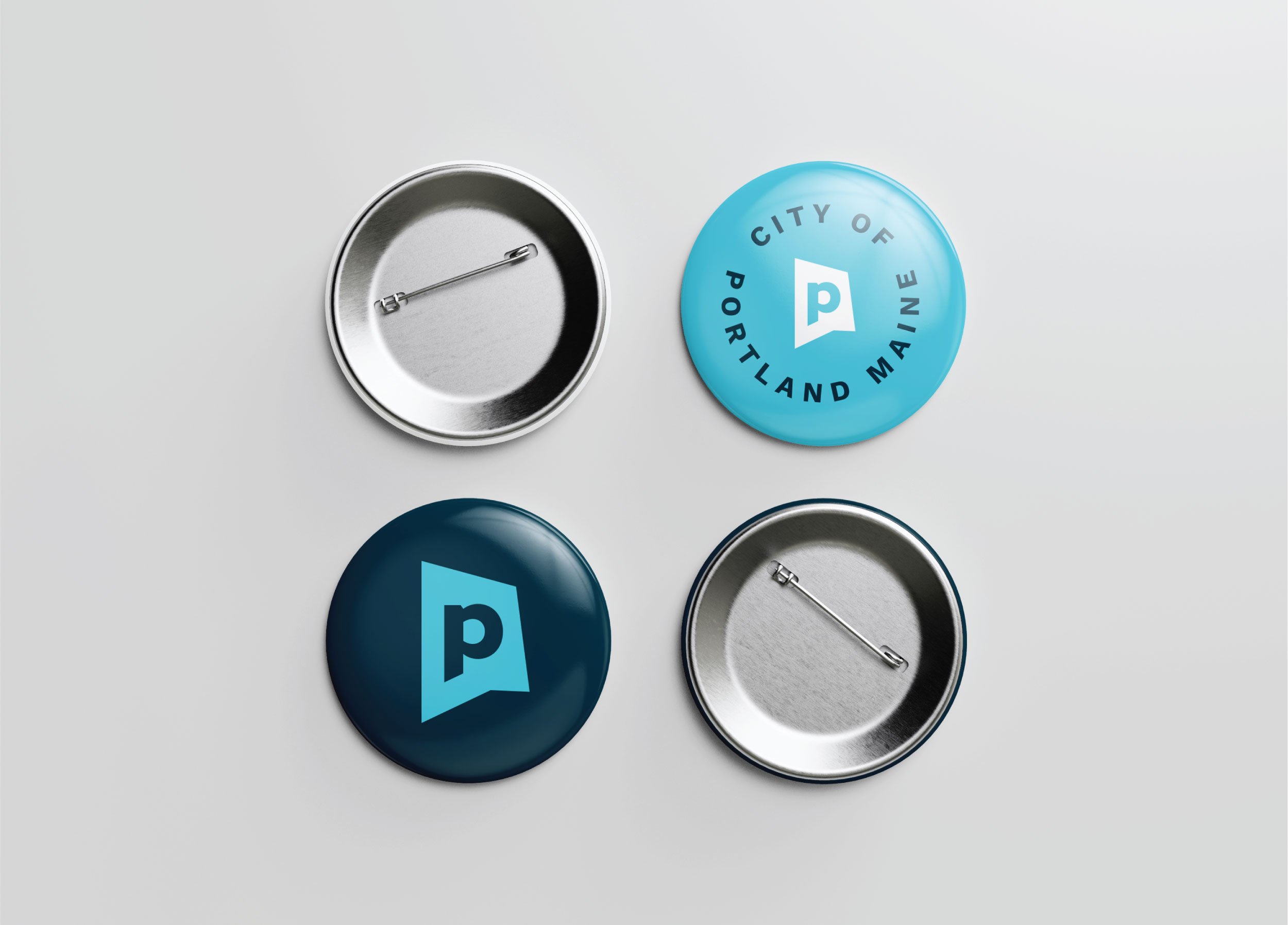
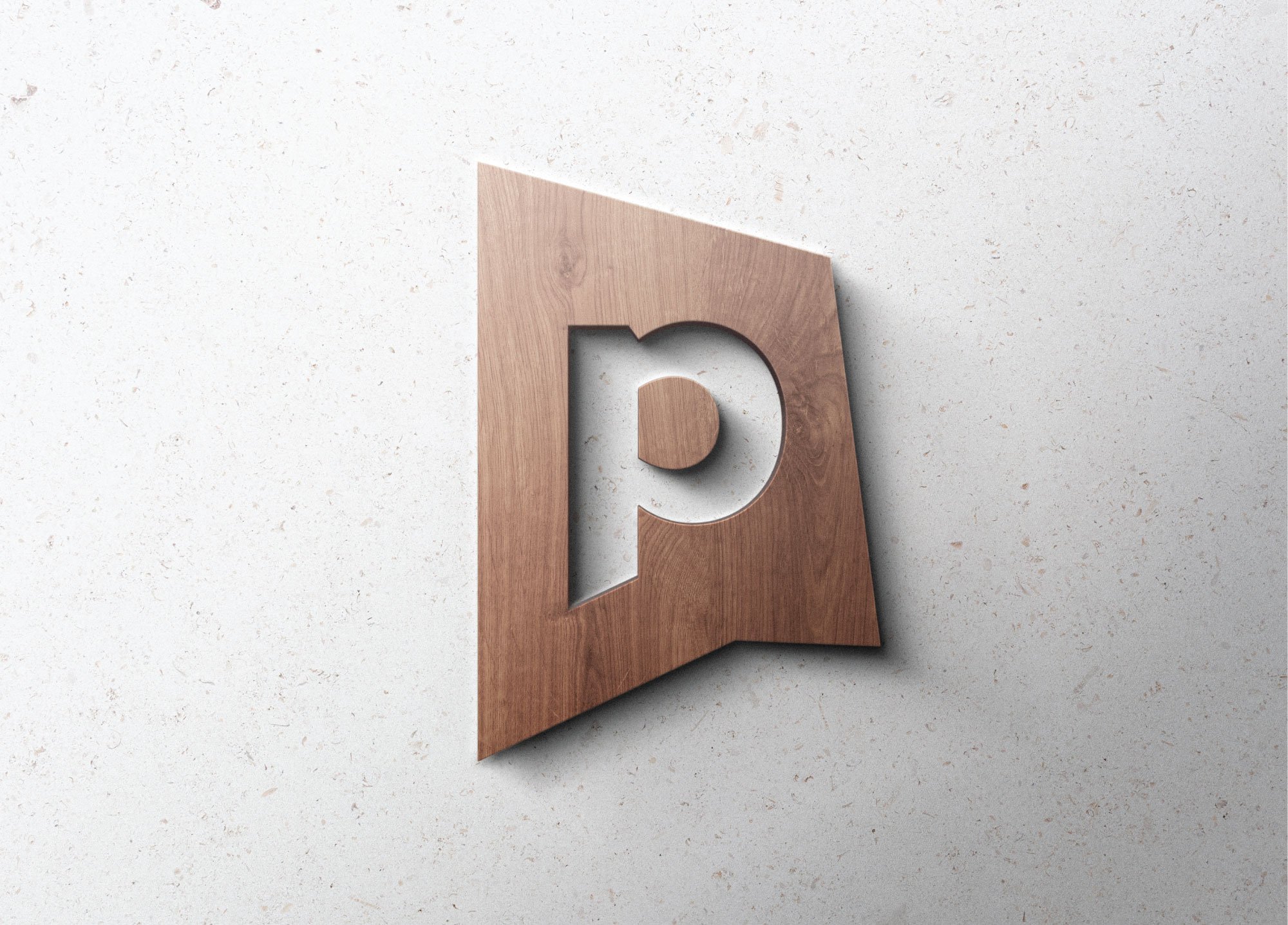
We proposed 10 simple yet unique directions to the City aimed at creating a sense of unity and pride with Portlanders. After thoughtful deliberation, the City selected the direction below. The abstract P badge brand mark reinforces the City’s communication agenda through the use of a subtle talk bubble. The mark is also an abstraction of the shape of the city. Some may also see an abstract shape of the letter P, and others have said it reminds them of the shape of the state of Maine. Abstract representation allows for creative interpretation and speaks to Portland’s diverse and evolving populations—inviting residents, business owners, as well as new and existing community members to be part of the conversation.

Primary, secondary, and circular logos for the City of Portland’s brand toolkit.
The wordmark’s confident yet friendly and curved letterforms represent our unique “big little city” and small-town welcomablity. The lowercase wordmark with “City of” creates an approachable sense of unity and connection by bridging the gap between the ascenders of “land” (the space between the l and the d).
Once the logo system had been selected and refined, we moved into department logos and color exploration. The department logos exclusively utilize a locally designed typeface called Expo Sans. Expo was designed by Portland-based type foundry TypeCulture, founded by Mark Jamra, (who taught both LK and Abby at Maine College of Art & Design). Each department was grouped and color coded, using the City’s secondary color palette.
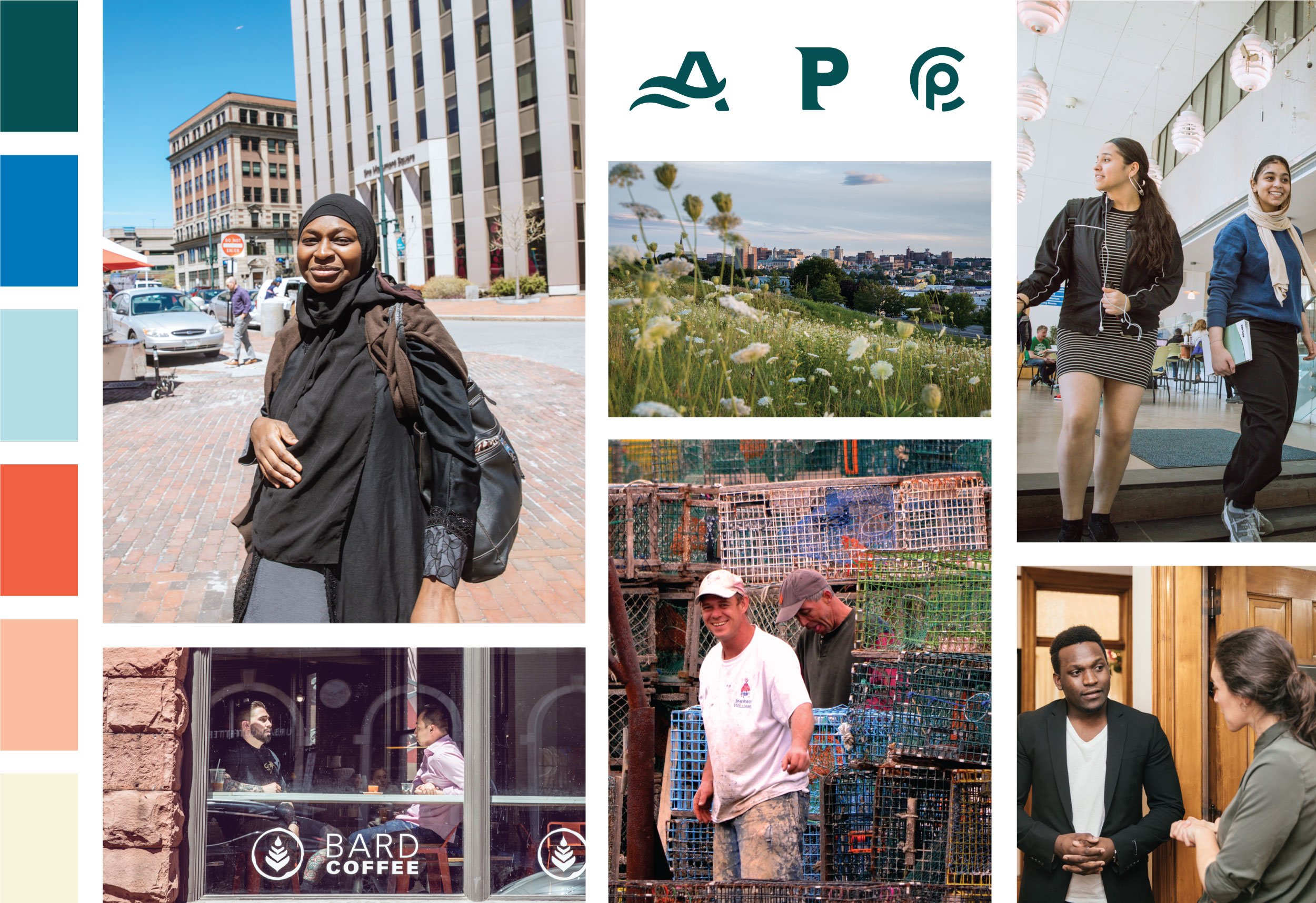
The primary logo colors—“Casco” navy and “Bay” light blue—pull from the coastal character of Portland’s location. The secondary palette gives a crisp, fresh, bright take on everything the city has to offer. The “Resurgam” yellow represents a hopeful, optimistic and energetic confidence. The “Exchange” reddish orange pulls from the working waterfront and historic brick architecture. The “Parks” and “Promenade” teals/green are a nod to the City’s open green spaces and a sense of renewal. The added “Island” blue evokes reliability, trust, strength and the City’s responsibility to its people. The “Monument” color brings a subtle neutral tone to balance out the saturation of the palette as a whole.


Photos by Corey Templeton.
Once the logo, department logos, and color palette were all finalized, we began typography exploration. Having worked with the City on their public health campaign, Stay the Course, we were familiar with the City’s need for translated assets. It was not only crucial for us to select typefaces that were widely accessible to all staffers for print and digital spaces—we also needed typography for both English and Arabic assets. Google Fonts were the natural choice since they are released under open source licenses, meaning you can use them in any non-commercial or commercial project and they’re accessible through Google programs like Docs and Sheets, which the City uses frequently.
Montserrat was chosen for headlines for its extreme legibility. Merriweather, the selected serif body copy, has a more classic feel but is also highly legible and easy to read on screens, featuring a large x height and slightly condensed letterforms. Source Sans Pro is the City’s secondary font, useful for condensed spaces, infographics, charts, or online CTAs. We selected Mada and Mirza as the respective header and body typefaces for any assets requiring Arabic. Mada has a similar look and feel to geometric Montserrat, and Mirza reflects the timelessness of Merriweather—meaning translated assets would have a cohesive look regardless of the language they are in.
From there, we focused on brand buildout, including: pattern development, brand photography special use cases, Canva and Google Slide template designs. The pattern reflects themes of community, forward momentum, a working waterfront, and honors the City’s unique and creative characteristics. Patterns are a powerful tool for communicating a brand’s personality in a playful and visually engaging way, acting as a touch-point of connection.

Brand buildout, including a custom pattern.
Corey Templeton’s stunning Portland photography was a big source of inspiration for us when it came to buildout. The brand mark P badge encourages a sense of playfulness and his photography allowed us to celebrate Portland’s personality and unique neighborhoods. These special use photo badges are created by special request by Portland Design Co.

Special use case photography, featuring Corey Templeton’s photos.
Letterhead and business cards are also available to City staff. We developed letterhead in Google Docs, as well as Microsoft Word templates for accessibility. In addition, we partnered with the City and Curry Printing who developed a staff portal where employees can customize and order business and appointment cards.
Through clear and efficient communication of services, a unified brand identity, messaging, and guidelines for all city departments—as well as consistent approaches to sharing information—Portland aims to increase engagement with residents and workers. We’re so grateful to have played a part in this collaborative project for a city we adore and in support of Portland’s public communications and engagement efforts.
Special thanks to Jessica Grondin, Director of Communications & Digital Services at the City of Portland, Nicole Manganelli for her incredibly thoughtful copy writing and editing, Sadie St. Germain of St. Germain Design Co. for design support, and the entire team at Blaze Partners!