
Brand Guidelines: The Why

Brand guidelines for Outdoor Wise Living.
“The key to the value of well-known brands such as Apple, Nike, Starbucks, Target and United Way, to name a few, is that the owners/users of these brands have adhered to a strict set of guidelines for the use of their logo and other graphic standards in all communications, marketing and advertising. These guidelines, when strictly followed, result in a brand that is strong and stable, and is easily identified in the marketplace. Each and every application of the brand is a deposit in the bank of brand equity which continues to build and grow.”— City of Albuquerque
At Portland Design Co, we spend weeks, months, (and sometimes even years) crafting a visual identity for our clients. The client has been invested in the collaborative process right alongside us. To protect and preserve all of that hard work—and the new brand's integrity—we create a set of brand standards outlining how the logo and visual assets should be used. We believe this is a critical step in creating a brand that has a long and successful life. We recently wrapped up the branding phase for our client, Outdoor Wise Living—an outdoor lifestyle brand with a mission to inspire others to get outdoors: benefiting mind, body, and soul. They donate 5% of sales to organizations that encourage people to spend more time outside.
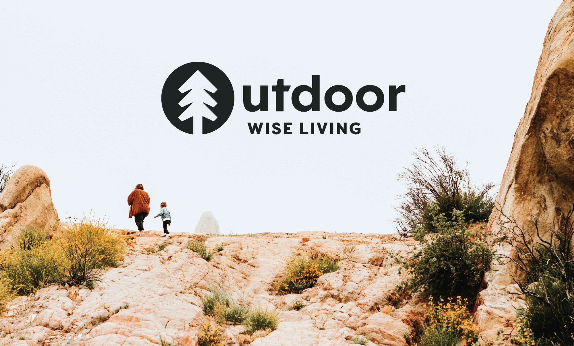
Recently completed logo for Outdoor Wise Living, paired with on-brand photography that aligns with the company’s values, color palette, and style.
Logo usage detail from Outdoor Wise Living’s brand guidelines. Logos should never be compressed, stretched, rotated, have a drop shadow, be unevenly cropped, or crowded with additional text. Clear space has been provided for each logo in the brand’s tool kit.
Brand guidelines can be quite extensive, outlining everything from company history to tone of voice, as well as mission, values, and much more. Some brands, like Starbucks, even have online microsite that outlines everything from logo usage to seasonal illustrations and palettes.
While we definitely dive into brand values, keywords, and visual inspiration in our brand questionnaire at the start of each project—our guidelines have client usability in mind. A 10 page PDF is much more approachable (and therefore more likely to be used by clients) as opposed to a 50 page guide that includes every single detail of the brand. Instead, we focus on all-things-visual. This includes every logo in the client’s toolbox, logo clear space and minimum sizes for print, color palette and logo color combinations, typography, how your photos should interact with photography and what that photography might look like. The more comprehensive brands we work with may have additional rules for icons, illustrations, patterns, or guidance on apparel.
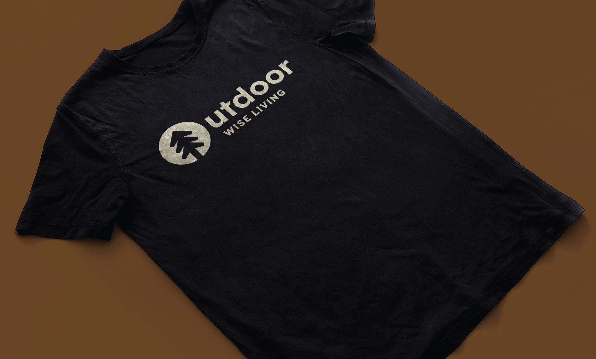
Branded apparel example for Outdoor Wise Living using their primary colors, Night and Neutral.

Photography from Outdoor Wise Living.
Brands that consistently adhere to their brand standards are building recognition and across all touch-points. They’re creating a sense of trust with their audience—customers feel a sense of comfort when they know what to expect. Guidelines are typically shared with employees, contract designers, printers, and anyone else who will be working with the brand, upholding visual integrity and ensuring consistency among all assets and platforms. They act as an important resource to anyone interacting with the brand and add equity when used correctly.
Looking for a visual identity and brand guidelines? We’d love to hear from you! Or, check out these great brand guideline examples if you’re looking for inspiration.