Brand Refresh vs. Rebrand
Sometimes a creative brief calls for a simple refresh—working with a brand’s existing logo elements to modernize the iconography and typography for a much needed reboot. In other cases, a complete rebrand is necessary to adapt the brand’s look and feel to current times, changing target audiences, and/or to create alignment with the organizations’ updated mission, values, and goals. Regardless of the brief, our common goal throughout each of these redesigns is to create a simplistic, legible, timeless logo that lasts for a decade or more.
If you’ve worked with us, you know there’s some behind-the-scenes homework that helps us really dig into your organization/business. Our goal is to help brands embody who they are and turn that into visual identity—an authentic representation of what they stand for. It’s important that we ask the right questions and uncover the how/why of a brand before pencil meets paper. Our brand questionnaire is such an important piece of the process.

Established organizations and businesses are constantly experiencing growth and change—the logo they opened up shop with may not be a reflection of where they stand in the marketplace today. Their brand voice or the products or services they sell may be in misalignment with how they’re putting themselves out into the world.
A brand refresh will likely depend on the extent to which your brand image needs updating. We’ve worked on projects that have a strong brand foundation—they know who they are, are confident and consistent with their brand voice, yet their logo, color palette, or typography feels outdated, is difficult to reproduce, or isn’t a great (visual) reflection of who they are today. Below are a few examples of before and after logos for brands that have opted for a refresh over a full overhaul.
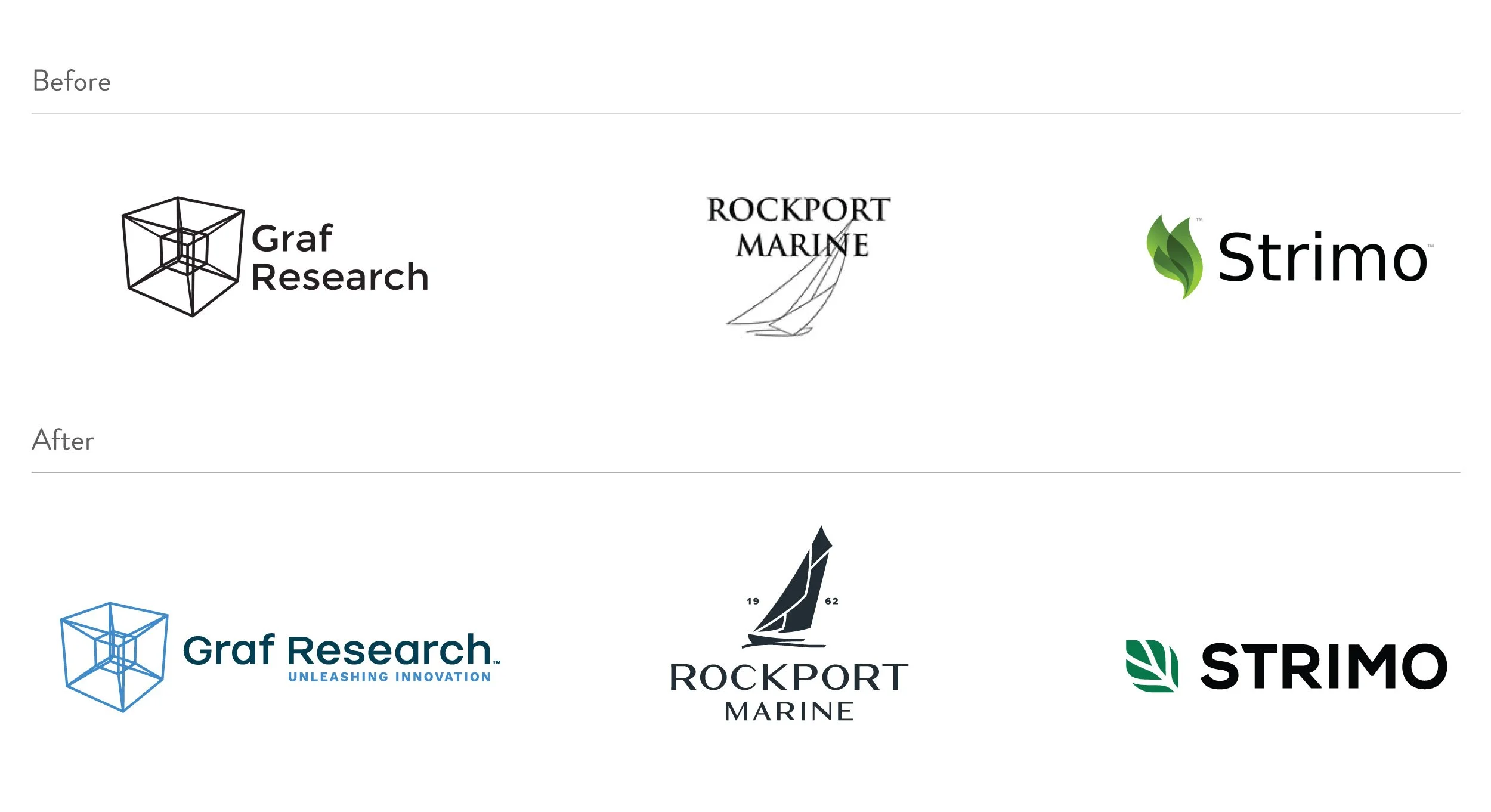

Refresh: Strimo
Strimo is the leading ERP solution for the cannabis industry. Their robust platform helps cultivators, processors, and manufacturers manage their inventory, processes, workforce, and costs across the cannabis supply chain.
With their highly experienced technology team and deep roots in cannabis, Strimo’s logo needed a slight refresh to match the companies’ confidence as a leader in the industry.
-
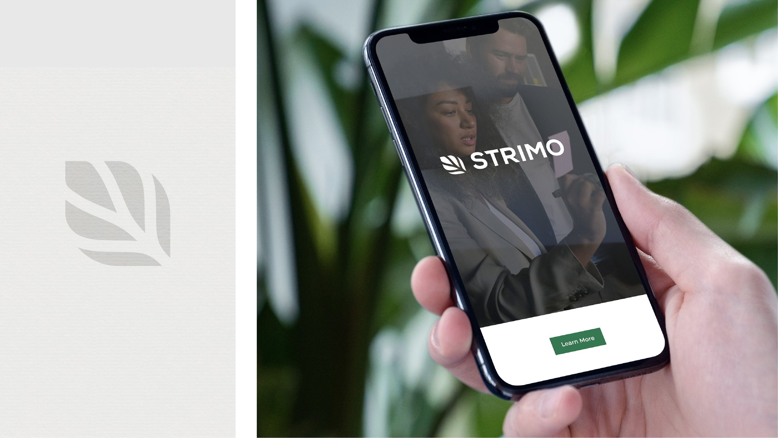
To remove the gradient, which caused issues with regard to reproduction on apparel, printed products, etc. The organization needed a logo that could work well in one-color for merch.
To keep the leaf icon but modernize and simplify.
-
We designed a scalable leaf brand mark that Strimo could easily reproduce on merchandise, employee gifts, print and digital collateral, etc.
We unified their core palette and provided Pantones for the brand (before it was digital-only).
In addition, a cohesive icon set was designed to match the look and feel of their new logo + palette.

A rebrand is a more time intensive process for all involved, and the reasons for a complete overhaul can vary. A business might want to reposition their company and brand vision. Or, they might be expanding their offerings, merging with a new partner, or looking for a way to appeal to a new market. Here are a few rebrand examples we’ve had the opportunity to work on throughout the years:
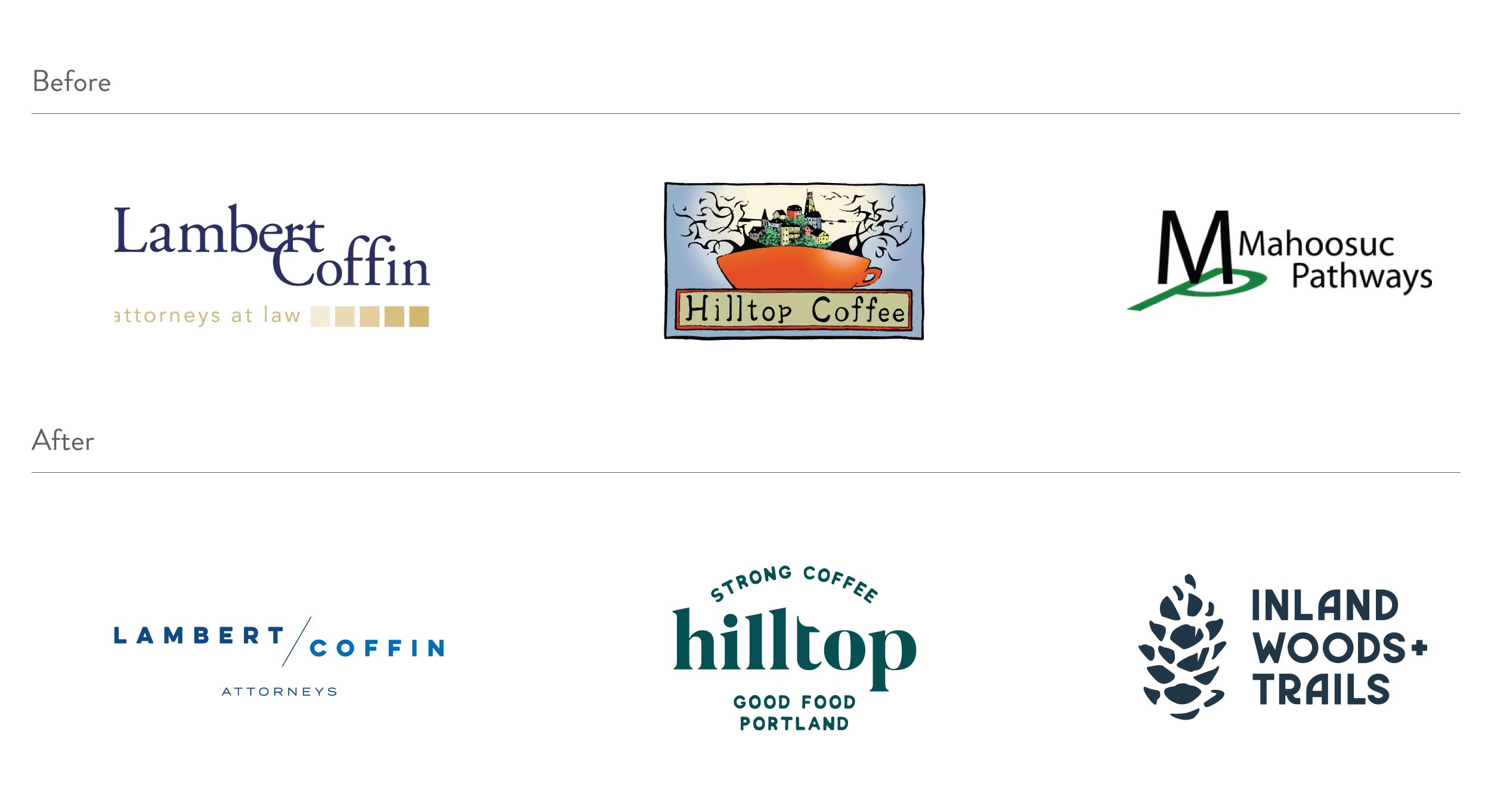

Rebrand: Inland Woods + Trails
When IW+T reached out to us, the organization was called Mahoosuc Pathways and was looking to not only rebrand but rename so that the community as a whole could better understand the organization’s offerings.
As their network of multi-use recreational trails continued to expand into western Maine, the name needed to reflect this regional growth without focusing on one specific area.
-
To give the organization a new name that encompasses more than the Bethel, Maine region.
To make their offerings more clear to the community, which would increase engagement, funding opportunities, etc.
To create a logo that was reflective of the outdoors and inclusive of all ages and abilities. -
The questionnaire process really helped us dive into name development. Once the board selected an option to move forward with, we explored a range of approachable outdoor logo options and landed on the pine cone icon — a great representation of nature that many people are able to connect with.
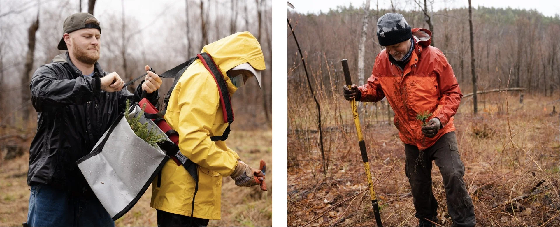
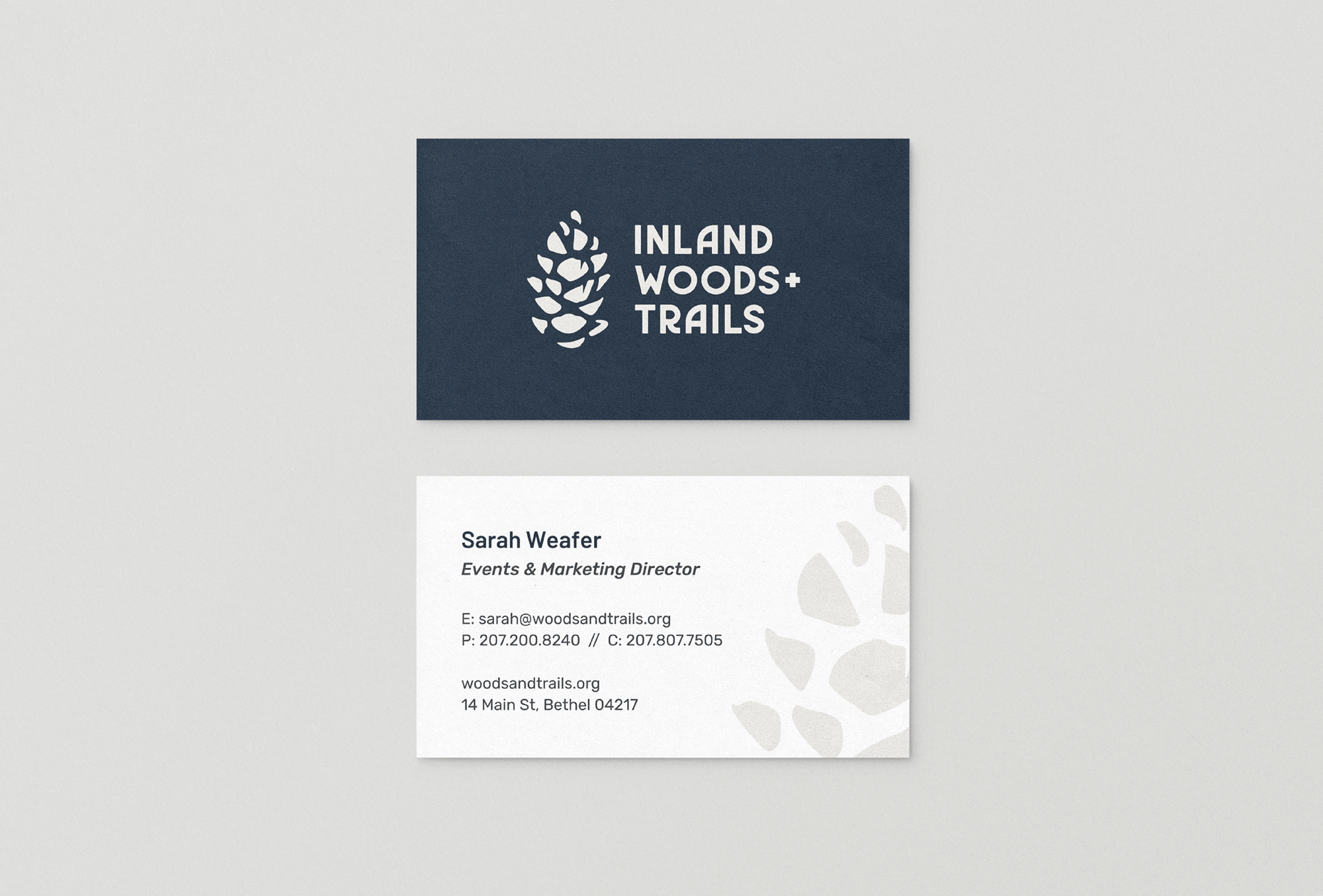
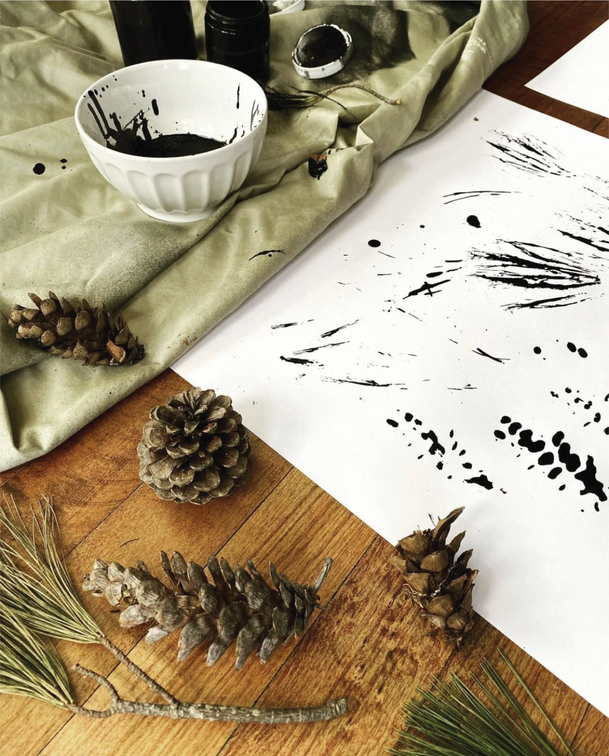
We provided 20+ land and location-based names that were inclusive of the surrounding communities—beyond Bethel. The new name, Inland Woods + Trails, gets right to the heart of the organization’s mission: accessible year-round trails for all ages and abilities. It was important that the new logo referenced the outdoors in an approachable, humanistic way—to attract and motivate landowners, trail users, funders, and community members —all of whom are crucial to the organizations’ success. The pine cone icon was made by dipping a real pinecone in India ink, and rolling it on paper. From there, shapes were refined and perfected to create a scalable and recognizable pinecone image. The type is highly customized to reflect the fun, woodsy feel of all things outdoors in Maine.
We recognize the extra work that goes into a rebrand—it’s a process that requires a new vision in order to inspire stakeholders (and employees!) to see your business in a new light. If you’re considering a refresh or rebrand, we’d love to connect with you to learn more about your why. Finding your companies’ reason will give your refresh or rebrand a necessary foundation, sense of direction, and focus.