
Choosing Type
Typography plays a central role in the success of a design and can strongly impact how viewers react. In this month’s blog post, we’ve compiled a checklist of key factors we consider when selecting a typeface for a project or brand. How does a particular typeface make us feel? Does the typeface’s emotive considerations suit the intended project? Does it have the basic weights and font styles? Are we thinking about accessibility more than usual for this particular project?
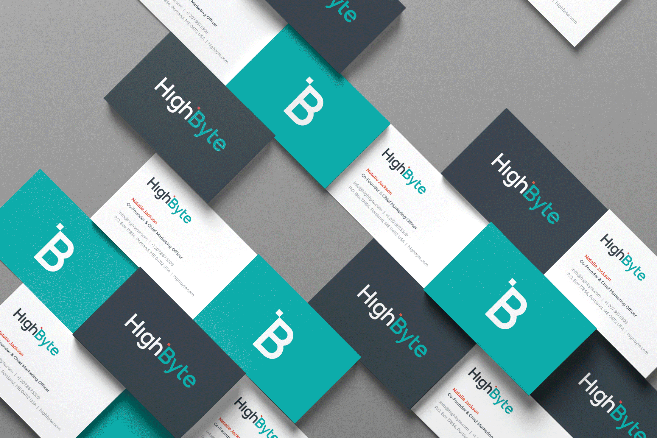
As visual identity designers, we’re often tasked with selecting a typeface when developing a new logo or when we’re designing a graphic for a client—from the lettering on a t-shirt to the fonts selected for use in an annual report or detailed infographic. Other times, we’re selecting type pairings for a brand, as a deliverable within their visual identity package. This is a specific collection of fonts that will be used on the company’s website, printed communications, products, and more, creating full alignment across all touch points. Brand consistency supports brand credibility and gives your customers confidence in your services or products.

Typography is an often overlooked but critical component to how a brand represents itself. Here are some of the tips, tricks, and questions we’ve asked ourselves when working with different brands throughout the years:
01 Have I connected with the client about their project goals?
The project scope in which a font will be used is one of the first things a designer should consider when choosing a typeface. Will it be used as the foundation for a logo? Is this an established business that’s looking to refresh their brand fonts for use on web and print collateral? If the later, will they need fonts in multiple languages, beyond Latin characters? Do they have a budget for font licensing? Are they a municipality or government-funded agency that’s required to adhere to web accessibility standards? Create a list of your client’s needs when kicking the project off. The typeface you select for use in a logo is likely going to be much different than the typeface you might select for a company’s complete communications.

02 Does the emotion of the typography suit the mood of the existing brand or harmonize with the intended project?
-
Classic and timeless — marked with small strokes or extensions at the end of its longer strokes.
-
Often sturdy, with bold, block-like serifs.
-
Clean, modern, less formal, and serif-free!
-
Fixed-width fonts with characters that each take up the same amount of horizontal space (originally produced for typewriters).
-
Influenced by handwriting and calligraphy, scripts are often more formal with flourishes.
-
Fonts that resemble letters created by the human hand. They are often filled with character, adding a creative and personal touch.
-
Fonts that are intended to be read at large sizes and contain decorative or fine details.
Google compiled a great article about typographic classifications.
Type has personality—before you can even comprehend the words you’re reading, the stage has been set based on the particular fonts used. Spending the time necessary to research fonts that portray the company's brand tone is a must—it’s important that they act in harmony with the brand’s existing look and feel to suit the overall personality. We wouldn’t select a whimsical font like Comic Sans for a tech company that’s trying to maintain a certain level of seriousness and trust. Imagine how thrown off their customers would be after expecting and seeing a more refined font in all previous communications.
When we’re developing a logo for a client, we begin with a brand identity questionnaire that dives deeper into the project goals and expected outcomes. We ask clients if they gravitate towards specific font styles before logo development begins. Even though their response may not align with the industry standards, this input helps us get in the client’s head and create a unique logo that they will be proud of (that also speaks to their industry and audience.)
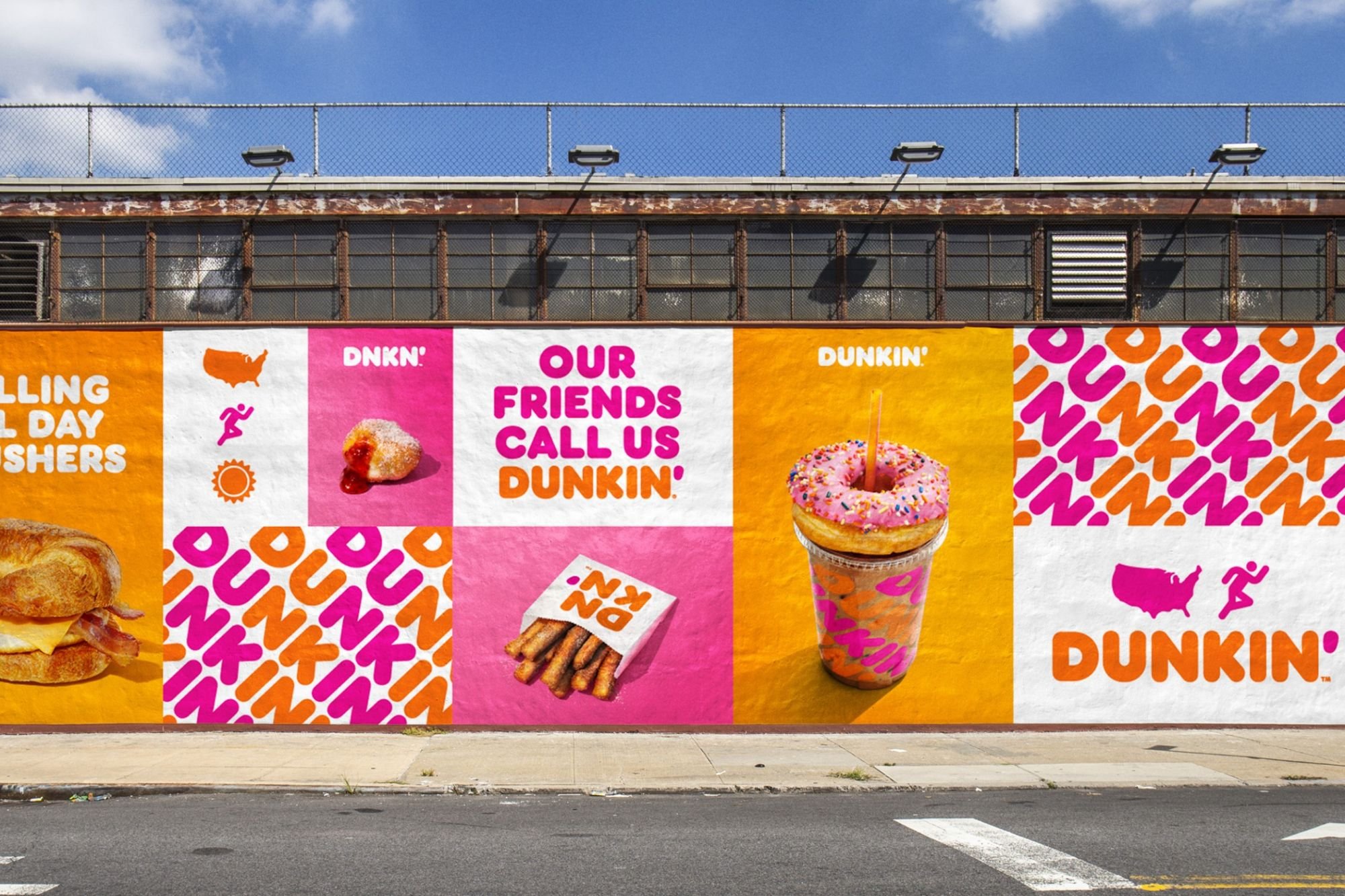
Credit: Dunkin’ Donuts. The font used in their logo looks identical to the type used elsewhere in communications, which isn’t commonly seen.
“The ideal scenario is for a brand to trust that we can help turn their identity into a well-balanced font. If the brand can define itself using descriptions to capture the tone, personality, and principles of the brand—to paint a thorough picture of who they are and who they want to be—we can translate that into typographic forms.”
— Monotype Type Designer, Malou Verlomme
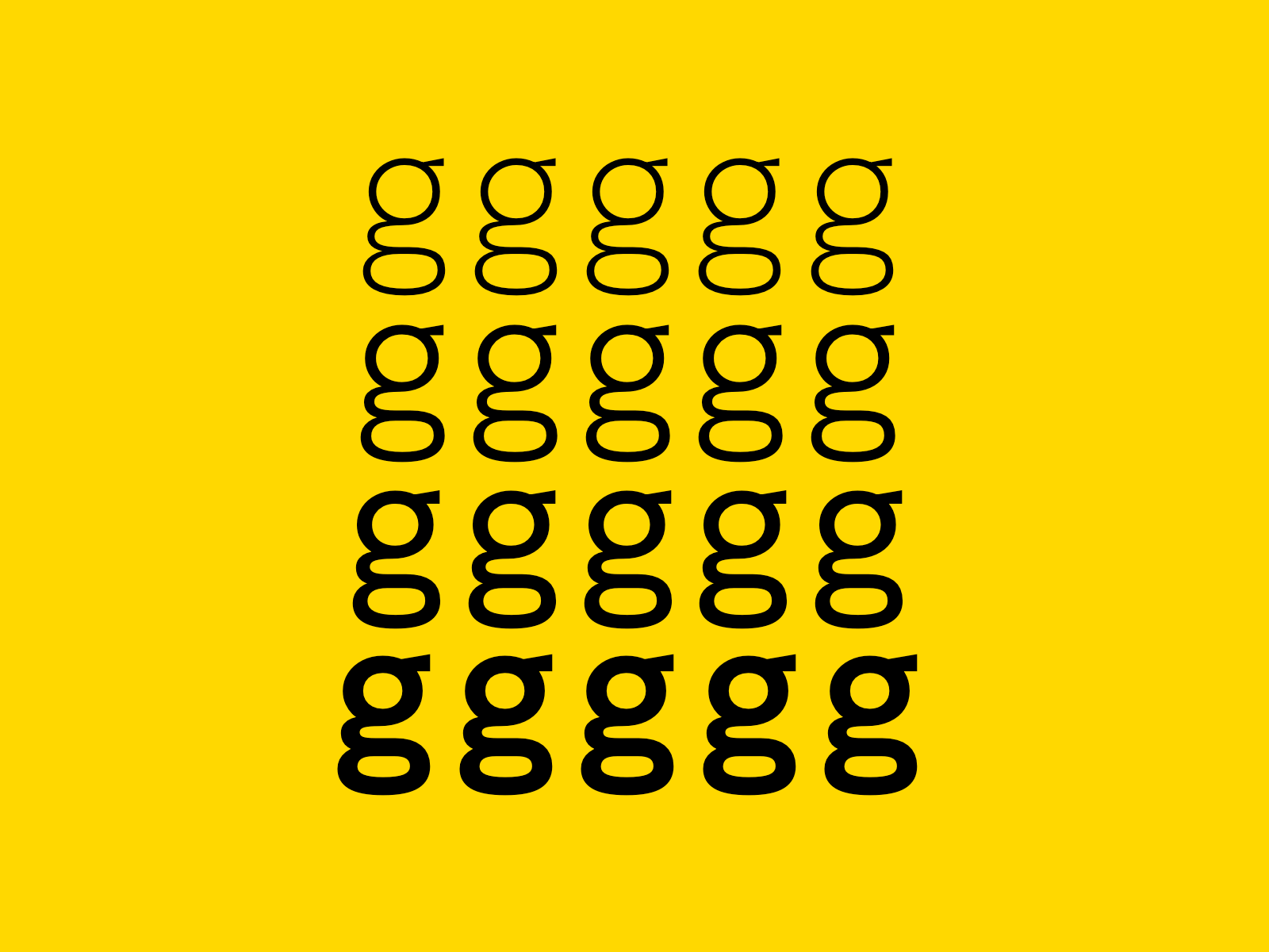
Credit: Elvin Tsang
03 Is the typeface comprehensive with various weights, widths, styles, and language support?
It can be really disappointing to find out the typeface you landed on doesn’t have italics, different weights or widths, multiple languages, or a specific character you need. When testing typefaces (beyond use in logo design) it’s important to review the more technical considerations. View the actual font files to ensure the listed design features are actually included. Test the full set of available fonts and characters, including glyphs and OpenType features. Google has compiled a fantastic post discussing these considerations in more detail. When in doubt, ask your client’s specific needs up front to determine the best plan.
04 Is there ambiguity between letterforms?
This can impact legibility (how distinguishable individual characters or words are to the eye of the reader), and readability (how easy it is to read the text overall). As the need and awareness for accessibility in design becomes more prominent, considering the details becomes that much more imperative.

Imposters are specific letter shapes that are designed in such a way that they are similar to other letter shapes—such as an upper case ‘i’, lower case L, and the number one in the Gill Sans typeface—which are are all nearly identical. Atkinson Hyperlegible on the other hand, clearly distinguishes those three characters from each other.
Mirroring is when letter pairs are the mirror image of each other, (a lowercase ‘b’ looks like a ‘d’). Certain typefaces, such as Andika add additional features to distinguish these similar pairs—helping the reader avoid confusion.
Discernibility can create issues for low-vision users, who may read a lowercase “c” as an “o”. If the letterform shapes are too closed, or their counters are too small, then they can begin to look very similar.
Before selecting a typeface for a client, it’s important to assess who the brand interacts with, and just how critical some of these checkpoints are. For municipalities communicating with 20k people daily, testing fonts for their legibility is critical.
Credit: Type Network
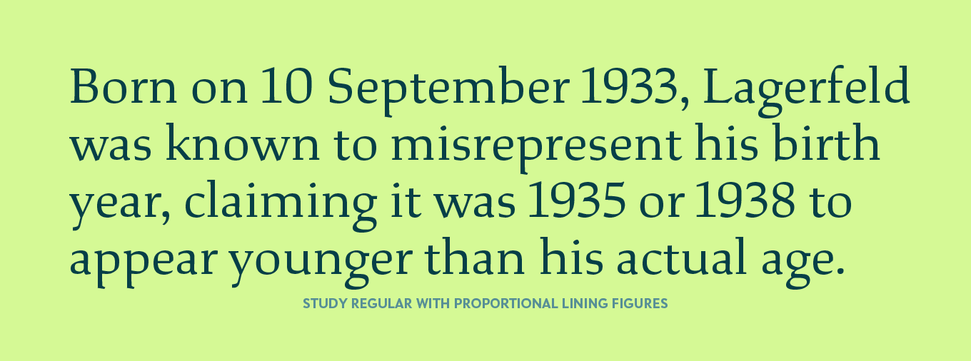
05 Are the numerals in this typeface proportional lining or oldstyle?
Oldstyle figures land below the baseline, sharing the same x-height as lowercase characters. These figures aren’t well suited to every application. The OpenType features may work well for designers who can play around with changing the oldstyle numbers to a more proportional lining figures, but we’re 99% sure your client doesn’t have access to programs that let them adjust OpenType features, swapping numerals as needed. We test numerals and punctuation to ensure there are no red flags in each typeface.
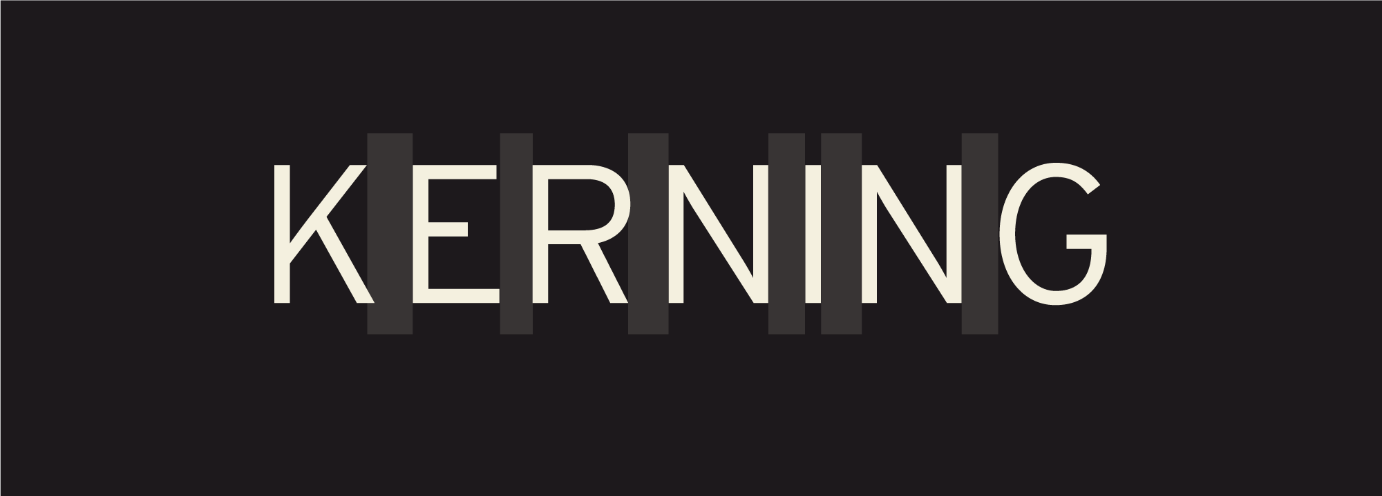
06 Does the typeface have adequate letter spacing?
Professional fonts should be properly spaced—meaning the spacing, or kerning between two particular characters has been adjusted by the type designer to increase legibility and readability. We highly recommend testing the suitability of any typeface in context.

Credit: Franny Fuller/Adobe
07 How do the type pairings we’ve selected for a client harmonize with each other?
From Google Fonts, “The single biggest challenge we face when pairing type is choosing a secondary typeface that’s different enough from our primary choice, but not too different. Jason Santa Maria, in his book, “On Web Typography,” refers to this as the balance between distinction and harmony:
“[...] you need to choose typefaces that don’t compete too much with each other, but aren’t so similar as to be indistinguishable. [...] When in doubt […] pair a serif and a sans serif. This provides you with what are likely the two most flexible kinds of typefaces, and nearly guarantees you have sufficient variation.”
At PDC, we do a lot of testing to see how typefaces pair together. There are many online resources offering tips on how to pair fonts, such as Fontpair.
08 Is the font open source or do I need to purchase the license (or have my client purchase one)?
All fonts, whether free or not, have an associated license with them. By using a font, you’re essentially agreeing to uphold the licensing terms. At PDC, we supply clients with a unique collection of Google Font pairings for headers, body copy, and secondary needs. Google Fonts are free and open source for use in print, digital, and commercial projects and products. They’re most commonly licensed under the SIL Open Font License, which allows for redistribution, making it easy for us to supply clients with the full font families as part of their brand deliverables. More on licensing from Google Docs, and a great video from Monotype.
09 Is the typeface compatible with the programs your client uses regularly?
A few of our clients heavily rely on Microsoft programs for all internal communications. We test the fonts in Microsoft programs to call out which fonts may or may not present issues, and select backup font options that can be used in these programs if needed. Calibri is the default Windows font, so while we can assume this may be a good fit, it’s important to look up font licensing for any font before choosing it for a client. (Even though Calibri is pre-installed on many computers, you need a license for use on websites or web development.) Additionally, it’s not always possible to load just any font into a Google Doc, so be sure to test the top selections and have your client test as well.
10 Similarly, should I connect with my client’s web developer?
Depending on the scale of your project scope, you may consider calling a meeting with the client’s web designer or developer before you select and begin testing type pairings. While it’s difficult to foresee every avenue your client may explore, some projects may have limitations. The web developer may have insights on what is or isn’t possible ahead of time. It may be something as simple as an embed code they need from your Google Font, or you might be restricted to web fonts only.

While this isn’t a comprehensive list, we hope this checklist gets you thinking about some of the technical considerations a designer might take when selecting type.
Because we’re often working with brands we develop from the ground up, or working alongside brands with an existing visual presence—we get much more detailed with the process of choosing type or adhering to a brand’s existing style guidelines. A font you’re using in a one-off slide deck won’t need nearly as much flexibility as a brand’s entire visual presence, so communicating with your client is critical to identify the full scope.
We hope this guide comes in handy and if you’re looking for a laugh, check out one of our favorite SNL skits :) Thanks for reading!
Additional Type Resources
-
What’s trending in type, font lists, look books, a flawless typography checklist, and so much more.
-
The entire Adobe Fonts collection is included with all Creative Cloud plans, with fonts available for web and print use.
-
Linked in various locations throughout this article, this comprehensive database is divided into topics that are filled with tips from global typographic experts.
-
When presenting your brand online, it’s ideal to work with a web designer that takes WCAG compliance seriously. While we may select typefaces that were the best fit for accessibility, the WCAG guidelines should be closely followed to ensure typography on the website is properly sized, spaced, in appropriate colors for all users. In 2018, Section 508 of the Rehabilitation Act of 1973 was updated, “requiring every online platform run by federal bodies or any organization that receives federal funding must be accessible for all users. Under updated rules, these sites have to comply with the WCAG 2.0 Level AA.” Read more.
-
A fun sketchbook/archive style website, great for inspiration. Friends of Type features original typographic design and lettering – fresh visual content – practically every day, by the four primary contributors.
-
WhatTheFont provides instant font identification (powered by MyFonts.com, which is another great resource for clients who have the budget to purchase paid font licenses.)
-
A comprehensive e-book comprehensive e-book by Erik Spiekermann — filled with 127 pages of history, visuals, and more information about typography.