Logo Design: Why Less is More
“The purpose of your logo is not to explain or define what your business does. It’s primarily meant to create consistent emotional engagement. This is where simple logos excel, as the calling card for your brand’s image; the first and last way your brand connects with the hearts and minds of its users.

Since Google unveiled its new brand identity system last September, I’ve been reading a lot about how they are following the current logo design trend of “simplicity”. Frankly, I’m having a hard time with that. Primarily because, simplicity is not the latest fad. Simplification is a timeless principle of exceptional graphic design. Objectively, it’s the primary method used in logo design for creating memorability and in fostering brand affinity. No matter what critics tell you about the immutable laws of a good logo, simplicity is transcendent above all the others.”
At PDC, we could not agree more. Some of the most successful and recognizable brands in the world are rocking minimal logos, and for good reason. Simplicity is an effective and timeless design cornerstone and instantly recognizable brands like Google, Nike, and National Geographic, for example, show that “less is more” in logo design is here to stay.

Imagine you’ve recently invested $5k in hiring a designer to create a new logo for your startup. You’ve completed the entire process and are now ready to apply the logo to your end product. You send the logo over to the print shop and they reply with bad news—it won’t reproduce well at a small size. Nowhere in the logo design process did the designer ask the ways in which you intend to use the logo in the future (maybe you had planned to order embroidered staff tees as a holiday gift.) In an ideal world, your designer will have asked this question before the process even begins, and/or they’ve supplied you with a toolbox of logo formats to suit various needs and levels of detail. We like to tackle this from the get-go with our clients in the logo discovery phase with a comprehensive questionnaire that helps us better understand the client’s end goals.
Executing simplicity is complex design work. “If logos are crucial in making a lasting connection with users, memorable logos must be powerfully simple to be simply powerful.” — Source
It can actually be more challenging to create a simple logo, (like the Penguin Books’s mark above), then if you were to draw out a realistic penguin, with every feather and detail in tact. It forces you to focus on including only the most important elements to make the mark recognizable as a penguin in the minds of your audience—leaving behind any unnecessary details.
One of our latest branding projects for the Town of Monson, Maine is a good example of a logo exploration—each in a different style, showing varying levels of detail. Each scene depicts the town’s beautiful backdrop of Lake Hebron and Russell Mountain but with a range of complexity and detail. The version on the left was created digitally, using Adobe Illustrator and a Wacom tablet. The style is simple, stamp-like and has hand-wrought details. The version on the right was hand drawn with lead pencil, requested by the client after seeing the branding for Harmon’s. It has depth, texture, and feels especially fitting for a small, tight-knit town of 700 residents with a rich history of artistic tradition.

Though the detailed lead drawing may feel more unique to this particular client/town, the lead style has limitations that should be discussed with the client during the process. Things to consider are:
The fewer details you have, the easier it will be to preserve the quality of your design when you resize the logo.
The lead-drawn logo would work well for large applications, such as a wall mural, prints, and a vehicle wrap, but would be limiting in small areas, and is trickier to reproduce in certain applications such as embroidered apparel or the small space allotted to social media profile images.
If the client were to select the more detailed option, we would suggest using the wordmark only for small applications, screen printing, embroidery, etc.
The mark on the left is vector (not a raster image, like the lead drawing) meaning it can scale up to any size without pixelating.
Brands are opting for simplicity. “Over the last century, our lifestyles gradually became more complex. Conversely, the design of logos became simpler for ease and speed of recognition in a faster world.” — Source
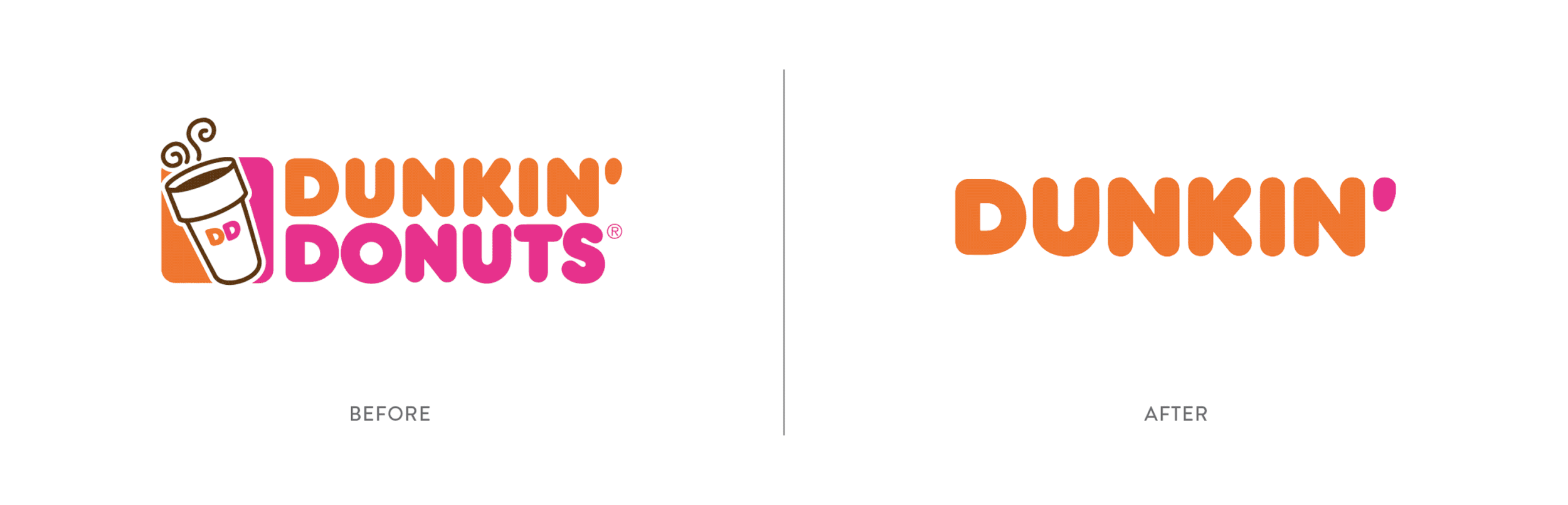
As the digital world continues to evolve, companies are gaining awareness of just how important it is to maximize how their brand presents itself online—and why simplification in logo design makes their brand more memorable, legible, and usable. Below are some examples of brands that have opted to simplify in recent years.
Additionally, responsive design systems are becoming more common. “Responsive logos are shape-shifting logos that change in size, complexity or even color to accommodate and adapt to wherever they are placed.” — Source. The full-detail version is used when the space is available, but the logos simplify (yet remain recognizable) when the amount of available space decreases. Thanks to Joe Harrison for helping us articulate the concept with these scalable branding visuals:

Simple logos are typically more accessible to users with visual impairments. Designing with accessibility in mind means being inclusive to the needs of your users.
Overly detailed logos with complex typography, gradients, or shiny metallic effects and drop shadows aren’t accessible for all audiences. About 3.7% or 12 million Americans are colorblind and as many as 43.5 million Americans may have dyslexia. The internet is filled with endless resources on accessibility in design, but in general an accessible logo should:
Use colors that enhance comprehension, but do not use color alone to convey information.
Use a legible typeface that takes dyslexic audiences into account. We wrote a blog post touching on this last year.
Leave out the small details. Fine lines and complexities may be lost when the logo is reduced in scale. Alternatively, consider a responsive logo system.
Forgo the gradient in your logo. Instead, use gradients as accents where legibility isn’t critical.